Brent Ozar recently ran a salary survey for people working with databases, and posted an article: Female DBAs Make Less Money. Why?
Many of the responses were along the lines of “Well, duh.” I, personally, felt much of the same thing.
But, I think with something like this, there is a risk for confirmation bias. If you already believed that women were underpaid, there is a chance that you’ll see this as more proof and move on, without ever questioning the quality of the data.
What I want to do is try to take a shot at answering the question: How strong is this evidence? Does this move the conversation forward, or is it junk data?
Consider this blog post an introduction into some statistics and working with data in general. I want to walk you through some of the analysis you can do once you start learning a little bit of statistics. This post is going to talk a lot more about how we get to an answer instead of what the answer is.
Data Integrity
So, first we want to ask: Is the data any good? Does it fit the model we would expect? Barring any other information I would expect it to look similar to a normal distribution. A lot of people around the center, with roughly even tails on either side, clustered reasonably closely.
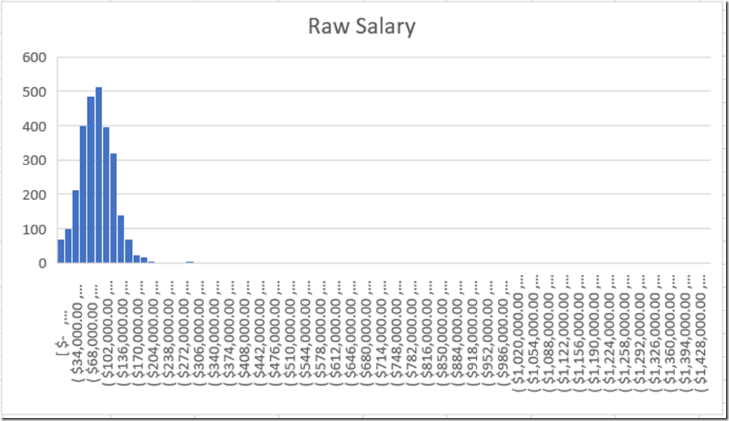
So if we just take a histogram of the raw data, what do we get?
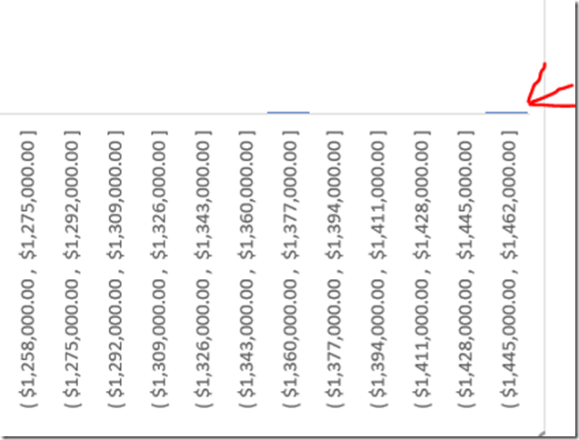
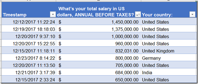
So, we’ve got a bit of a problem here. The bulk of the data does look like a normal distribution, or something close to it. But we’ve got some suspicious outliers. First we have some people allegedly making over a million dollars in salary. That’s why the histogram is so wide. Hold on, let me zoom in.
Even ignoring the millionaires, we have a number of people reporting over half a million dollars per year in salary.
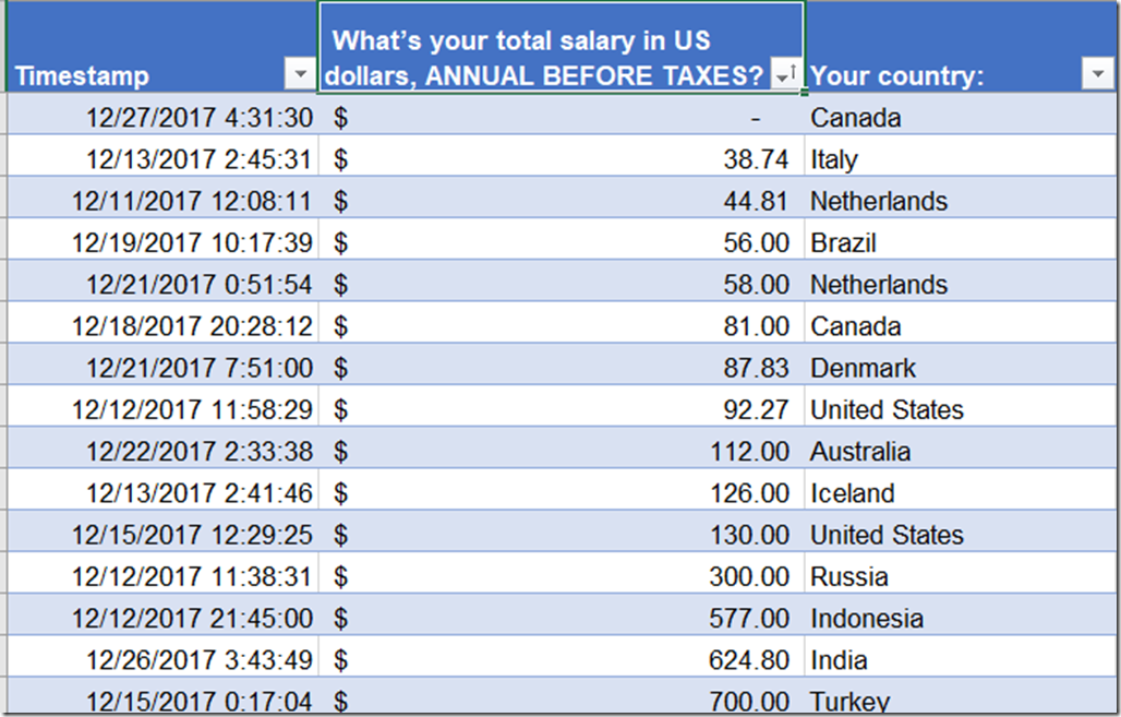
We’ve also got issues on the other end of the spectrum. Apparently there is someone in Canada who is working as an unpaid intern:
Is this really an issue?
Goofy outliers are an issue, but the larger the dataset the smaller the issue. If Bill Gates walks into a bar, the average wealth in the bar goes up by a billion. If he walks into a football stadium, everyone gets a million dollar raise.
One way of looking at the issue is to compare the median to the mean. The median is the salary smack dab in the middle, whereas mean is what we normally think of when we think of average.
The median doesn’t care where Bill Gates is, but the mean is sensitive to outliers. If we compare the two, that should give us an idea if we have too much skew in either direction.
So, if we take all of the raw data we get a $4,000 difference. That feels significant, but could just be the way is naturally skewed. Maybe all the entry level jobs are around the same, but the size of pay raises get bigger and bigger at the top end.
Averages after removing outliers
Okay, well lets take those outliers out. We are going to use $15,000-$165,000 as a valid range for salaries. Later on I’ll explain where I got that range.
There are 143 entries outside of that range, or about 5% of the total entries. I feel comfortable excluding that amount. So what’s the difference now?
So the middle hasn’t moved, but the mean is about the same now. So this tells me that salaries are evenly distributed for the most part, with some really big entries towards the high end. Still, the $4,000 shift isn’t too big, right?
Wait, this actually is an issue…
Remember when I said 2 seconds ago that $4,000 was a significant but not crazy large? Well, unfortunately the skew in the data set really screws up some analysis we want to do. Specifically, our friend Standard Deviation. We need a reasonable standard deviation to do a standard error analysis, which we cover later.
Standard Deviation is a measure of the spread of a distribution. Are the numbers clumped near the mean, or are they spread far out? The larger the standard deviation, the more variation of entries.
If a distribution is a roughly normal distribution, we can predict how many results will fall within a certain range: 68% within +/- 1 standard deviation, 95% within +/- 2 deviations, 99.7% within 3 deviations.
Well, because of the way standard deviation is calculated, it is especially sensitive to outliers. In this case, it’s extremely sensitive. The standard deviation of all the raw data is $66,500 . When I remove results outside of $15-$165K, the standard deviation plummets to $32,000. This suggests that there is a lot of variability in the data being caused by 5% of the entries.
So let’s talk about how to remove outliers.
Removing Outliers
Identifying the IQR
Remember when I got that $15,000-$165000 range? That’s by using a tool called InterQuartile Range or IQR.
It sounds fancy, but it is incredibly simple. Interquartile range is basically the distance between the middle of the bottom half and the middle of the top half.
So in our case, if we take the bottom half of the data, the median salary is $65,000. If we take the top half of the data, the median salary is $115,000. The IQR is the difference between the two numbers, which is $50,000.
Using IQR to filter out outliers
Okay, so we have a spread $50,000 between the first and third quartiles. How do we use that information? Well there is a common rule of thumb that anything outside +/- 1.5 IQR is an outlier. In fact, when you see a boxplot, that is what is going on when you see those dots.
So, $50,000 *1.5 is $75,000. If we take the median ($90,000) and add/subtract 75,000 we get our earlier range of $15,000-$165,000
Standard Error Analysis
Okay, so why did we go through all that work to get the standard deviation to be a little more reasonable? Well, I want to do something called a Standard Error Analysis to answer the following question:
What if our sample is a poor sample?
What is our average female salary is lower because of a sampling error? Specifically, what are the odds that we samples a lower average salary by pure chance? “Poppycock!”, you might say. Well, standard error gives us an idea of how unlikely that is.
Importance of sample size
Let’s say there are only 1,000 female DBAs in the whole world, and we select 10 of them. What are the chances that the average salary of those 10 is representative of the original 1,000? It’s not great. We could easily pick 10 individuals from the bottom quartile, for example.
What if we sampled 100 instead of 1000? The chances get a lot better. We are far more likely to include individuals that are above average for the population as a whole. The larger the sample, the closer the sample mean will match the mean of the original population.
The larger the sample size, the smaller the standard error.
Importance of spread
Remember before we said that a reasonable standard deviation is important? Let’s talk about why. Let’s say there are 10 people in that bar, and that the spread of salaries is small. Everyone there make roughly the same amount. As a result the standard deviation, a measure of spread, is going to be quite small.
So, let’s say you take three people at random out of that bar, bribe them with a free drink, and take the average of their salaries. If you do that multiple times, in general that number is going to be close to the true average of the whole population (the bar).
Now, Bill Gates walks in again and we repeat the exercise three times. Because he is such an outlier, the standard deviation is much larger. This throws everything out of whack. We get three samples: $50,000, $60,000, and $30,000,000,000. Whoops.
The smaller the standard deviation of a population, the smaller the standard error.
Calculating Standard Error
Getting the prerequisites
To calculate the standard error, we need mean, standard deviation and sample size. Before we calculate those numbers, I want to narrow the focus a bit.
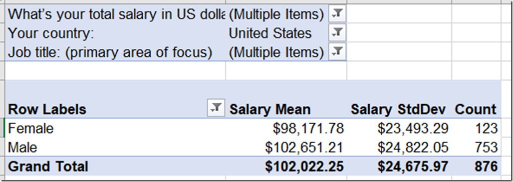
I’ve taken the source data, and narrowed it down to US, DBA and within $15,000-$16,5000. This should give us more of an apples to apples comparison. So what do we get?
We’ve got a gap in average salary of about $4,500. This seems quite significant, but soon we’ll prove how significant.
We’ve also a standard deviation of around $24,500. If salaries full under a normal distribution, this means that 95% of DBA salaries in the US should be within $52,500-$151,000. That sounds about right to me.
Calculating individual standard error
So now we have everything we need to calculate standard error for the female and male samples individually. The formula for standard error is standard deviation divided by the square root of the count.
So for females, it’s 23,493 / sqrt(123) = 2118. This means that if we were only sampling female DBAs, we would expect the average salary to be within +/- $2,118 about two thirds of the time.
So, if we were to randomly sample female DBA’s, then 95% of the time, that sample’s average would be less than the male average from before.
That seems like a strong indicator that the lower average salary for females isn’t just chance. But we actually have a stronger way to do this comparison.
Standard error of sample means
Whenever you want to compare the means from two different samples, you use a slightly different formula which combines everything together.
The formula is SQRT( (Sa^2 + Sb^2) / (na +nb)) . S is the standard deviation for samples a and b. Standard deviation squared is also known as the variance. N is the count for samples a and b.
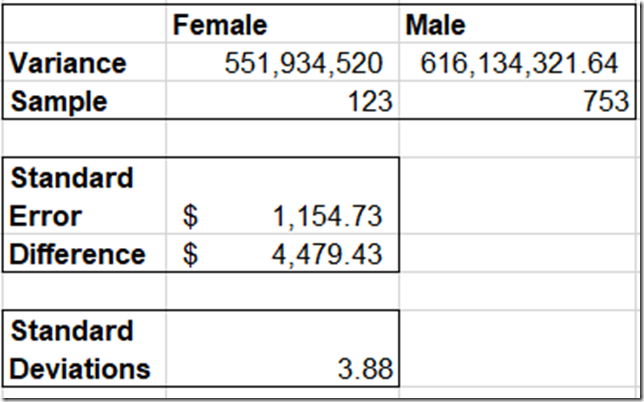
If we combine it all together we get this:
The standard error when we combine samples is $1,154. This indicates that if there was no difference between the distribution in female and male salaries, then 68% of the time they would be within $1,154.
Well in this case, the difference in means is almost 4 times that. So if the difference in means is 3.88 standard deviations apart, how often would that happen by pure chance? Well, we would see this level of separation 0.01% of the time, or about 1 in 10,000.
Conclusion
I take this as strong evidence that there is a real wage gap between female and male DBAs in the USA.
What this does not tells us is why. There are a number of reasons that people speculate as to the cause of this gap, many in Brent’s original blog post and the comments below it. I’ll leave that to them to speculate what the cause is.
