All posts by Eugene Meidinger

Lessons learned from being self-employed: 5 years in

Content warning: burnout, health issues

I have not been looking forward to writing this blog post. I started the series, inspired by Brent Ozar’s series, because being able to see how the other side lived helped me to evaluate the risks and take the leap to work for myself. Unfortunately, that commitment means writing about one of the worst years of my career, and what has felt largely like a waste.

A health scare

2023 started off in a state of burnout, techniques for recovery that worked in the past had stopped working. I was forced to try taking 2 consecutive weeks off for the first time in my career, and it helped dramatically. Also, during this time I was panicking about the change in payments from Pluralsight, and I reached out to everyone I could think of who sold courses or had a big YouTube channel for advice. Thank you to everyone who spent the time to help.

As a result I had decided I was going to start selling my own, self-hosted courses. I think I had hoped that I could just ramp up the social media a smidge, ramp down the consulting a smidge, and make it all work. If I could go back in time, I would have cut down on all extraneous commitments and focused just on this. Instead, I tried to make it all work, because of what I thought I “should” be able to accomplish, or what I had been able to accomplish in years past.

Around this same time, Meagan Longoria (along with others) convinced me at SQLBits to raise my consulting rates by 30%. Meagan has the tendency to be painfully blunt, while also being kind and empathetic. I think it’s difficult to nail both candor and kindness at the same time.

The health scare came in March, when I started weighing myself again. Travel from Bits and work had caused me to fall out of habit with exercising. What I found was I was the heaviest I had been in my entire life at 300 lbs. Even heavier than when I was in college and considered myself fairly obese. I had gained 20 lbs in 3 months, which as a diabetic is very very bad.

Barreling towards burnout

I decided I needed to do something, so I bribed myself with a Magic the Gathering booster every morning I exercised, and a Steam Deck if I could do that daily for 3 consecutive months. Overall, that worked, but I did find that in my mid 30s, it’s hard to just push through like that. I have to be careful, or I’ll develop plantar fasciitis or some other issues for a while.

At the same time, however, my work requirements had picked up. I had signed up for a volunteer position with a local organization that had become very stressful. I had work projects that had dragged on longer than they should and were starting to frustrate my customers. And I had found that the branding and marketing of selling my own courses involved much much more work and executive function than I had realized.

I did end up contracting and then hiring part time a local college grad to be my marketing assistant. She was recommended via a close professor friend of mine and overall she has been great. The biggest challenge has been acclimating someone to our particular niche of the data space and what the community is like.

Around June, I realized I was simply spread too thin. I had experienced being physically unable to get out of bed any sooner than was physically necessary. I was physically unable to get up an hour early for work to try to push through a project or deadline. I was should-ing myself to death, taking on more than I could handle because I thought I should be able to do more, because I thought people would be disappointed in me if I had to close out projects and work.

Ultimately, the largest threat to my health and well-being was my own personal pride.

Turning the corner

Thankfully I did decide to wind down as much of my consulting work as I could. It took multiple months longer than I would have preferred, honestly. I closed out any open projects that I could easily do so, and now I’m down to 2 customers that are a few hours per week. I also decided that I wouldn’t take on any new projects during November or December.

I’ve also been focusing on making that course and I officially have given myself a hard deadline of February 5th. At the moment I have absolutely no idea how well it will do. If it does well, that means I can continue to focus on making training content for a living. If not, I’ll have to consider pivoting into more of a focus on consulting or going back to a regular job. I would have preferred to be releasing this in the summer of 2023, but here we are.

I think the hardest thing to grapple with regarding burnout, is the uncertainty of how long it will take to recover and how aggressive you have to be in resting to recover. I’m grateful to both Matthew Roche and Cathrine Wilhelmsen for putting that into perspective.

There are days that I feel much better, I feel energetic and enthusiastic. Coming back from PASS Summit, I felt that way all week. But at the moment it’s still fragile, and I have to remind myself that a good day in a week doesn’t mean the issue has been totally solved yet.

One other thing, I always struggle with the lack of sunlight in the winter. For the first time ever, I’m being proactive about it and going somewhere warm in December instead of January or February when the issue becomes apparent. So, I’ll be spending Christmas week in San Juan, Puerto Rico where it is currently 80 degrees Fahrenheit. See y’all on the other side of 2024.

Fabric Ridealong Week 3 – Trying to put it into a table

Last week, I struggled to load the data into Fabric, but finally got it into a Lakehouse. I was starting to run into a lot of frustration, and so it seemed like a good time to back up and get more oriented about the different pieces of Fabric and how they fit together. In my experience, it’s often most effective to try to do something, review some learning, and alternate. Without a particular pain point, it’s hard for the information to stick.

As an aside, I wish there was more training content that focused on orienting learners. In her book, Design for How People Learn, Julie Dirksen uses the closet analogy for memory and learning. Imagine someone asks you to put away a winter hat. Does that go with the other hats? Does it go with the other winter clothes? An instructor’s job is to provide boxes and labels for where knowledge should go.

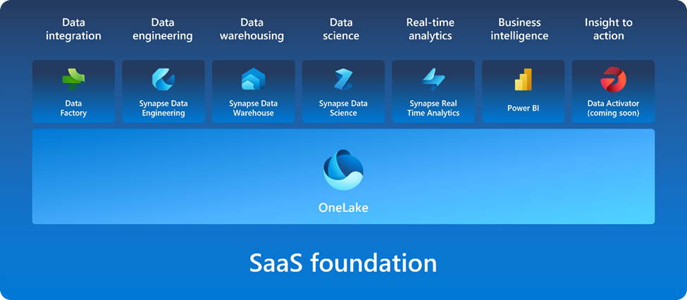
Orienting training content says “Here are the boxes, here are the labels”. So if I learn Fabric supports Spark, should I put that in the big data box, the compute engine box, the delta lake box, or something else entirely? If you are posting the Microsoft graphic below without additional context, you are doing folks a disservice, because it would be like laying out your whole wardrobe on the floor and then asking someone to put it away.

Getting oriented

So, to get oriented, first I watched Learning Microsoft Fabric: A Data Analytics and Engineering Preview by Helen Wall and Gini von Courter on LinkedIn Learning. It was slightly more introductory than I would have liked, but did a good job of explaining how many of the pieces fit together.

Next, I starting going through the Microsoft learning path and cloud skills challenge. Some of the initial content was more marketing and fluffy than I would have preferred. For example, explanations of the tools used words from the tool name and then fluff like “industry-leading”.  This wouldn’t have helped me at all with my previous issue last week of understanding what data warehousing means in this context.

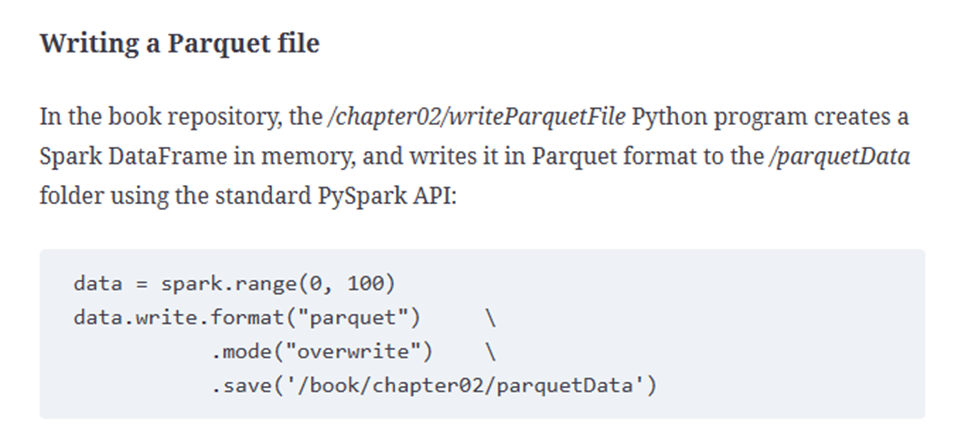
After some of the fluff, however, Microsoft has very well written exercises. They are detailed, easy to follow, and include technical tidbits along the way. I think the biggest possible improvement would be to have links to more in-depth information and guidance. For example, when the Lakehouse lab mentions the Parquet file format, I’d love for that to have a link explaining Parquet, or at least how it fits into the Microsoft ecosystem.

Trying it with the MTG data

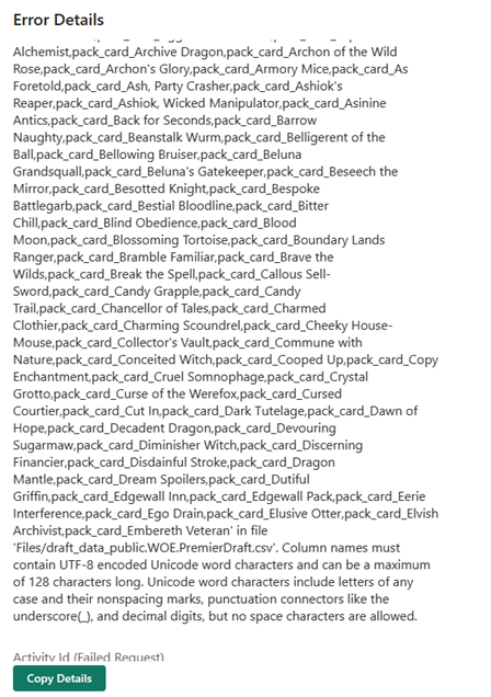
Feeling more comfortable with how Lakehouse works, I try to load the CSV to a lakehouse table and I immediately run into an error.

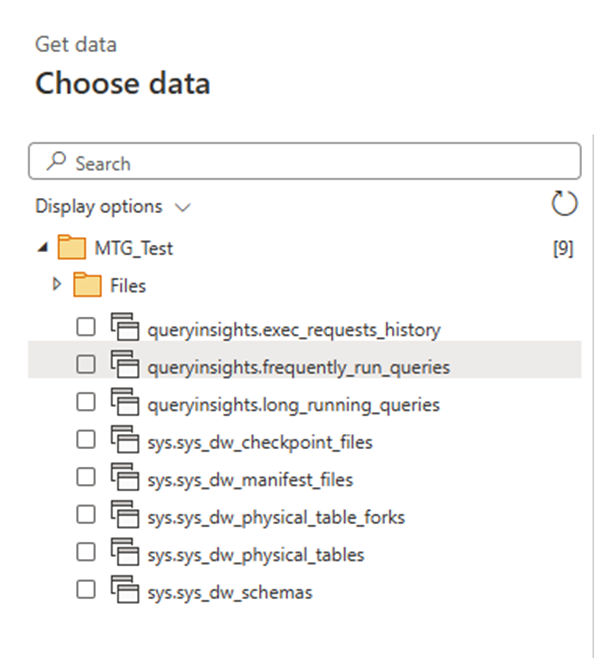
It turns out that it doesn’t allow for spaces in column names. It would be nice if it provided me with an option to automatically rename the columns, but alas. So next I try to use a dataflow to transform the CSV into a suitable shape. I try loading files from OneLake data hub, and at first I assume I’m out of luck, because I don’t see my file. I assume this only shows processed parquet files, because I can see the sales table I made in the MS Learn lab.

It takes a few tries and some digging to notice the little arrow by the files and realize it’s a subfolder and not the name of the folder I’m in. This hybrid files and tables and SQL Endpoints thing is going to take some getting used to.

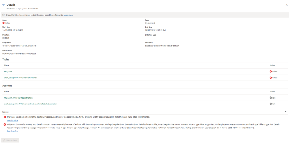
I create a dataflow based on the file, remove all but the first few columns and select publish. It seems to work for a while, and then I get an error:

MashupException.Error: Expression.Error: Failed to insert a table., InnerException: We cannot convert a value of type Table to type Text.

This seems…bizarre. I got back and check my data and it looks like plain CSV file, no nested data types or anything weird. Now I do see table data types as part of the navigation steps, but none of the previews for any of the steps show any errors. I hit publish again, and it spins for a long time. I assume this means it’s refreshing, but I honestly can’t tell. I go to the workspace list and manually click refresh.

I get the same error as before, and I’m not entirely sure how to solve it. In Power BI Desktop, I’m used to being taken to what line is producing the error.

It turns out that I also had a failed SQL connection from a different workspace in the same dataflow. How I caused that or created it, I have no idea. The original error message did include the name of the query, but because I had called it MS_learn, I thought the error was pointing me to a specific article.

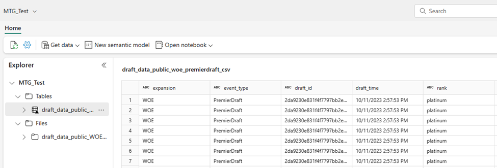
It takes about 15 minutes to run, then the new file shows up under…tables in a subfolder called unidentified. I get a warning that I should move these over to files. It’s at this point I’m very confused about what is happening and what I am doing.

So, I move it to files, and then select load to tables. Do that seems to work, although I’m mildly concerned that I might have deleted the original CSV file with my dataflow because I don’t see it anymore.

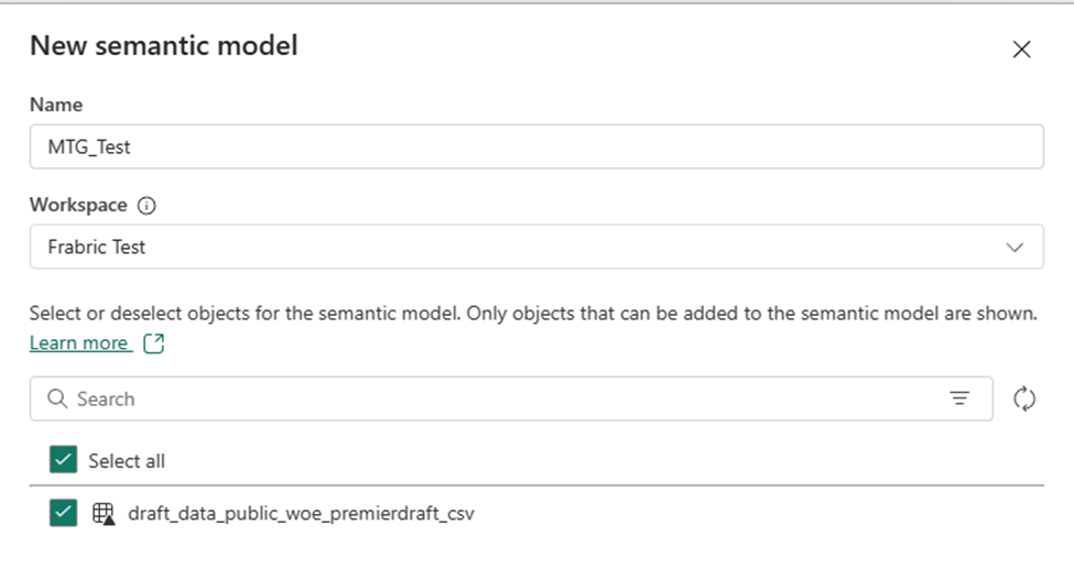
Additionally, I notice that I have been doing this all in My Workspace, which isn’t ideal, but that when I create a semantic model, it doesn’t let me create it there. So I have to create it in my Fabric Test workspace instead.

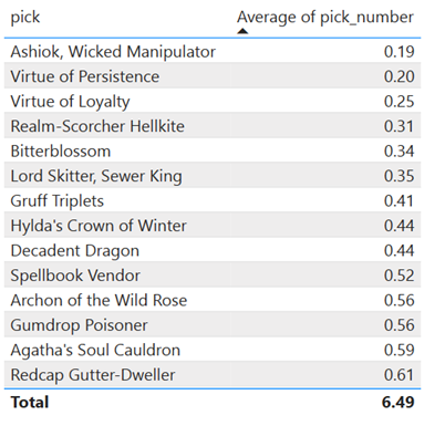
Regardless, I’m able to create a semantic model and start creating a report. Overall, this is promising.

Summary

So far, it feels a lot like there is a lot of potential with Fabric, but if you fall off the ideal path, it can be challenging to get back onto it. I’m impressed with the amount of visual tools available, this seems to be underappreciated when people talk about Fabric. It’s clearly designed to put Power BI users at ease and make the learning experience better.

I’m still unclear when I’m supposed to put the data into a warehouse instead of this current workflow, and I’m still unclear what the proper way is to clean up my data or deal with issues like this.

Fabric ridealong Week 2 – getting the data uploaded

I want to preface that a lot of the issues I run into below are because of my own ignorance around the tooling, and a lot of the detail I include is to show what that ignorance looks like, since many people reading this might be used to Fabric or at least data engineering.

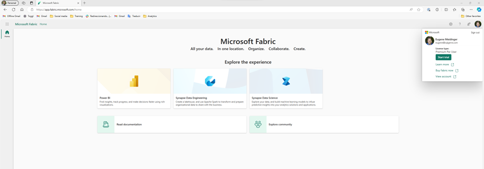
So, last week we took a look at the data and saw that it was suitable for learning fabric. The next step is to upload it. Before we do anything else, we need to start a Fabric Trial. The process is very easy, although part of me would have expected it to show up on the main page and not just in the account menu. That said, I think the process is identical for Power BI.

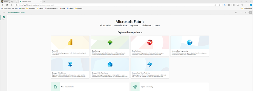
Once I start the trial, more options show up on the main page. Fabric is really a collection of tools. I like that there are clear links at the bottom for the documentation and the community.

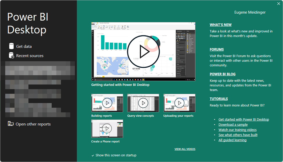
I think something that could be clearer is that the documentation includes tutorials and learning paths. While I understand that the docs.microsoft.com subdomain has been merged into the learn.microsoft.com subdomain, when I see “Read documentation” I assume that means stuffy reference material as opposed to anything hands on. This is an opportunity to take a lesson from Power BI Desktop by maybe having an introduction video, or at least having a “If you don’t know where to start, start here” link.

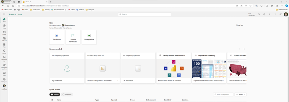
Ignoring all of that, the first I’m tempted to do is select one of these personas and see if I can upload my data. So, I take a guess and try Data Warehouse. Unfortunately, it turns out that this is more a targeted subset of the functionality. Essentially, as far as I would be aware, I’m still in Power BI. This risks a little bit of confusion, because the first 3 personas (Power BI, Data Factory, and Data Activator) are product names, so I’m likely to assume that the rest of them are also separate products. In part, because that’s how it historically has felt to me in Azure, as I’ve talked about when first learning Synapse.

Now thankfully, I’m aware that the goal of Fabric is to have more of a Power BI style experience, so I’m able to quickly orient myself and realize it is showing me a subset of functionality instead of a singular tool. I also see “?experience=data-warehouse” in the URL which is also a hint. So, I go ahead and click on the warehouse button, hoping this is what I need to upload my data. Unfortunately, I get a warning.

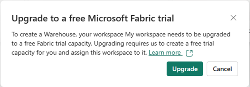
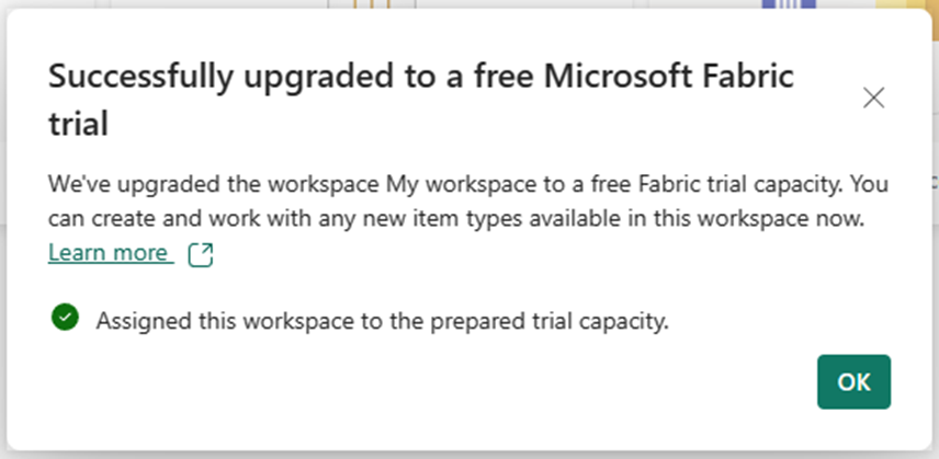
The warning says I need to upgrade to a free trial. But I just signed up for the free trial! Reading the description, I realize that I need to assign my personal workspace to the premium capacity provided by the free trial. This is a little confusing, and at first I had assumed I ran into a bug. I click upgrade and it works.

Finding where to put the data

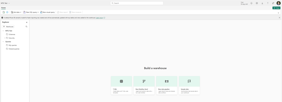
Next it asks me for the name of my warehouse. I choose “MTG Test” and cross my fingers. Overall it seems to work. Again, I’m presented with some default buttons in the middle. I see options for dataflows and pipelines, and I assume those are intended for pulling data from an existing source, not uploading data. I also see an option for sample data, which I really appreciate for ease of learning.

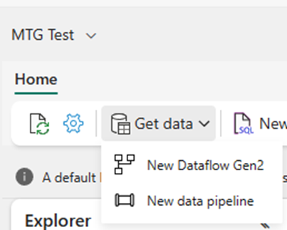
I see Get Data in the top left, which I find comforting because it looks a lot like Get Data for Power BI, so let’s take a look. Unfortunately, it’s the same 2 buttons. So, we are at a bit of an impasse.

I click on the dataflow piece, but I’m starting to feel out of my depth. If my data already existed somewhere, I’d be fine, but it doesn’t. I have to figure out how to get the data into the data lake. So I back up a bit and then Bing “Fabric file upload”. The second option is documentation on “Options to get data into the Fabric Lakehouse”.

The first option shows how to do it in the lakehouse explorer. I go back to my warehouse explorer, looking for the tables folder, but it’s not there. I see a schemas folder, which I assume is maybe a rename like how they recently renamed datasets to semantic models. I assume that maybe schemas are different than tables and that I need to find a more detailed article on Lakehouse Explorer. It probably takes me a full minute to realize that a warehouse and a lakehouse are not the same thing, and that I’m probably in a different tool.

So, I backup again and search for the more specific query “fabric warehouse upload”. I see an article called “Tutorial: Ingest data into a Warehouse in Microsoft Fabric”. I quickly scan the article and see it suggesting using a pipeline to pull in data from blob storage. So I know that’s an option, but I’m under the vague impression that there should be a way to upload the data directly in the explorer.

Giving up and trying again

I dig around in Bing some more and I find another article called “Bring your data to OneLake with Lakehouse”. From demos I’ve seen of OneLake, it’s supposed to work kinda like One Drive. At this point I know I’m misunderstanding something about the distinction between a warehouse and a lakehouse, but I decide to just give up and try to upload data to a lakehouse. The naming requirements are more strict so I make MTG_Test.

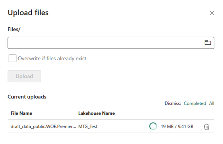
I got to get data, I see the option to upload files. I upload a 10 gigabyte file and it works! Next week I’ll figure out how to do something with it.

Summary

Setting up the fabric trial was extremely easy and well documented. As far as I can tell, there’s a lot of getting started documentation for Fabric, but I wish it was surfaced or advertised a bit better. I run into a lot of frustration trying to just upload a file, in part because I don’t have a good understanding of the architecture and because my use case is a bit odd.

Overall, I’m feeling a bit disheartened, but I have to remind myself that I ran into a lot of the same frustrations learning Power BI. Some of that was the newness, some of that is learning anything, and some of that I expect the product team will smooth out over time.

I also acknowledge that I’d probably have an easier time if I just sat down and went through the learning paths and the tutorials. In practice though, a lot of times when I’m learning a new technology I like to see how quickly I can get my hands dirty, and then back up as necessary.

Fabric ride-along Week 1 – Reviewing the data

This is week 1 where I try to take Magic the Gathering draft data to learn Microsoft Fabric. Check out week 0 for some reasoning why.

So, before I do anything else, I want to get a sense of the data I’m looking at to see if it’s suitable for this project. I download the data, and because it’s gzipped, I use 7-zip to open it up on windows 10, or Windows explorer on Windows 11. In either case, the first thing I notice is the huge size disparity. When compressed, it is a quarter of a gigabyte. Uncompressed, it’s about 10 GB. This tells us something.

The longer you work in business intelligence, and especially in consulting, the more you start picking up clues and making inferences. You do this because scope creep is extremely prevalent in BI, and if you are a consultant you might be the one paying for it. So, what does 40x compression difference tell us about the data?

40x is abnormal. In my experience with the Vertipaq engine in Power BI, on a good day you are looking at 5-10x compression compared to a SQL backend. So, we know that there is a lot of repeated data. Because this is the only file for this data, we can infer that we will have to do quite a bit of normalization. CSV is a flat format, so the source data is likely heavily denormalized in this case. I would be shocked if there was any nested or hierarchical data like you might expect with JSON.

The next step is to take a peek at the data. There might be documentation somewhere, but for whatever reason I prefer to just take a look and get a feel for it. So how do we do that? Well, someone experienced would probably use a dedicated tool for large files. But I’m not experienced, so I confirm that I have 32 gigs of RAM, double click on the file and cross my fingers. In doing so, I create the most viral tweet of my career.

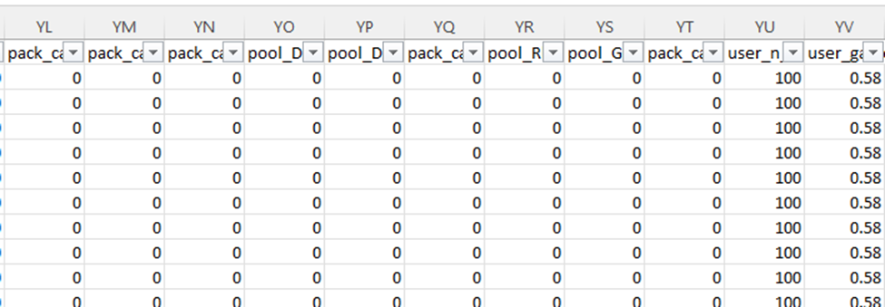
Excel complains that there are too many rows, but eventually shows me the first million of them. I take a quick glance to get oriented. The very first thing I’m scanning for is anything with the word “id” in it (1). The next thing I’m scanning for are repeated values (2), these are likely to go with the id as a header table or dimension table. Then I see pick number incrementing (3), so it’s likely functioning as a line number. Then I see a bunch of ones and zeros (4) to the right, and I don’t like that.

Issues with the data

I don’t like that because it’s data I don’t know how to deal with. My first guess is it’s data for data science that’s been turned into features. Columns like this are great for running experiments, but awful for traditional analytical reporting. I’ll likely have to reshape the data into something more dimensional, but I’ll have to learn how best to store this information. Doing a pivot is simple enough, but I have a nagging feeling I’m missing something.

So, the next question, is just how many columns do we have and what do they look like? I scroll over all the way to the right, and I see the letters YS. I don’t know how many that is, but I know it’s bad. Typically, in my work it never gets past A and another letter. I check and there are 672 columns!!!

Why so many columns? This data is around drafting Magic the Gathering cards. So, for each card in the specific magic set (a quarterly release of cards), we have a column if it was possibly in that card pack (the cards the player can choose from), as well as in the player’s already selected pool (the cards they’ve drafted). Essentially, for every card they could possibly see in a draft we are tracking what they have seen as well as what they have picked.

Accordingly, we have a very sparse dataset. Based on how the math works out, these columns will have 0 the vast majority of the time. I know that having lots and lots of columns interferes with run-length encoding, so leaving the dataset as is not ideal from a compression and performance standpoint. This does explain why the data compresses so well though, since most of it is long chunks of 0s and commas. The gzip algorithm is able to see that and substitute it.

There’s another issue with this shape. We have columns with specific names of the cards. The cards available each set are completely different, with only a handful of repeats. This means if we just merged in the schema each new set, we would have thousands of columns. This simply isn’t feasible; we have to reshape the data. We are going to need to learn how to dynamically unpivot the data, probably in Azure Data Factory, which I have no experience in.

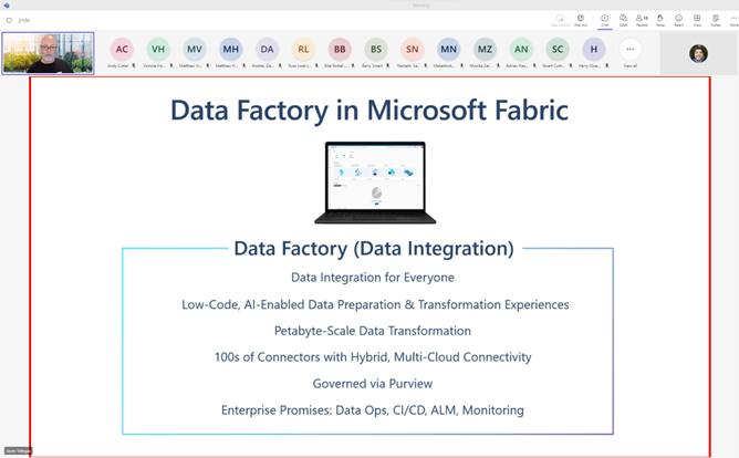
Coincidentally, Javier Villegas was giving a presentation on data ingestion in the Data Toboggan conference. I think an important part of learning technologies is giving yourself the chance for “serendipity” or “luck”. If you are regularly bumping into content, you can find content that is relevant to the problems you have. As I mentioned in week 0, if you don’t have active problems or active tasks you sometimes have to make your own.

Summary

We can tell the data is abnormally compressible and we need to figure out why. It turns out it is a sparse data set. The first thing I do is rapidly scan for id fields, numerically incrementing fields, and repeated values to get a sense of how I might normalize the data. Based on the current shape of the data, I know I’m going to have to pivot it. I’ll probably have to learn Azure Data Factory for that, but we’ll see. I know vaguely that Fabric has support for PowerQuery.

Fabric project ride-along: Week 0 – let’s wing it

I’ve written before about struggling to learn Azure Synapse, and I’ve struggled as well with getting excited about Microsoft Fabric. I think the pitch and the potential of Microsoft Fabric is real. The issue is that it solves problems I don’t have. In my work, I don’t deal with data so big that Power BI can’t handle it. I don’t deal with data so unstructured that Power Query can’t handle it.

But I know I need to learn Fabric. Power BI is a part of Fabric, the integrations are only going to continue to improve. If nothing else, I need to be able to tell customers if they should look into using Fabric or not. So what do you do when there is a technology you aren’t excited about, but have to learn?

One solution is to get certified. In the past, I’ve written about how I find certs to be useful learning paths and something concrete to focus on. Last week they announced the DP-600 certification which looks promising for that. Another option is to take on a work project that is a bit of a stretch and then learn on the job. As a consultant, that’s always a bit of a catch-22 because you are selling yourself based on expertise you theoretically already have. The last option is to create a homelab and a side project.

The challenge, though, is what do you put up there for a homelab? A lot of publicly available data is boring, purely descriptive, and/or already cleaned. For simple descriptive reporting, that’s perfectly fine. But for Fabric you want big data, ugly data, changing data. In comes the Magic the Gathering card game and a little data tracking project called 17lands.

Magic the Gathering and its big data revolution

Magic the Gathering, if you don’t know, is a competitive trading card game. With the rise of its online client, MTG Arena, it’s been going through a similar revolution like baseball and Sabermetrics (or so I assume, I’m not a sports guy). Now, instead of speculating which cards from a new set are the best, it’s possible to track in that in real-time thanks to a project called 17lands which collects data from players who opt in.

This has allowed for fascinating analysis. Even if you don’t play, I recommend checking out this video below. It’s fascinating to see how the “metagame” of a format evolves over time as people realize which cards are good and which cards are bad. It also allows for a lot of amateur analysis, for good and for bad. Then every 4 months it happens all over again with a new release.

This data seems ideal for a few reasons, first the raw data is big but manageable. A single “season” is 10 GB uncompressed, and 0.25 GB compressed. I did learn that Excel will try its best to open 10GB file, yell at you about too many rows, and then show you’re the first million. The 40x compression also suggests that the data is very denormalized and would benefit from some normalization.

It did end up showing me the first million rows

The second reason is that the schema is a mess. The data has over 600 columns, many of which are numerical flags for each individual possible card, which changes from season to season. Trying to manage this in Power Query is theoretically doable but likely very frustrating.

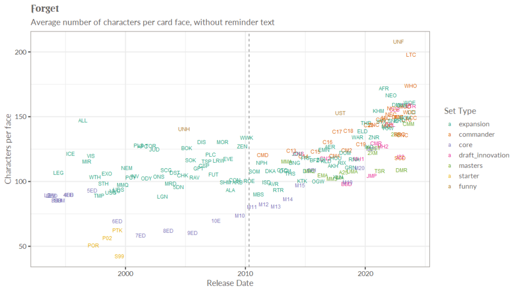
Finally, it’s something I’m interested in. MTG_ds on Twitter is constantly posting graphics like this (increasing wordiness of cards each release), with insights hiding behind the high level numbers.

A chart showing increasing wordiness of cards over time

There are actually questions that people are interested in, that aren’t easy to answer. I like to make replayable subsets of cards called “cubes“, so being able to do things like mathematically optimizing based on cost and fun are interesting to me.

Calling my shot

I think with this sort of thing, it’s important to document your expectation and pain points, because you only get to be a newbie once. I’ll try to write down my expectations ahead of time so we can see where I’m wrong.

From what I’ve seen so far, I expect the learning path at learn.microsoft.com to be very helpful in getting oriented. I expect a lot of content online to be frustrating, because so much of it assumes you have a data lake and know what you are doing.

Speaking of which, my background is as a former DBA and now Power BI consultant. I’ve never touched ADF, data lakes, or ML in and professional capacity. As the title says, I’m going to be winging it. What I do have, however, is experience having to learn a new technology in 2-3 months (see the course below) and experience breaking down big BI projects into smaller chunks.

The one year I needed to pay the bills and made courses on technology I had never seen before.

I hope you enjoy watching the ride and let me know if there’s anything specific you’d like me to include.

Hustle culture, welcoming everyone, and taking care of yourself.

Imagine for a moment that you went to the gym, and everyone there was really fit. Muscular and tone. You look around for cameras because you think you might be at a photo shoot. How would that make you feel? You might be excited because you are in the right place to improve. Or you might be like me and worry about fitting in, worry about annoying folks, worry that your goal of being a little bit healthier is too small.

That’s how YouTube is for me. I look at Guy in a Cube, and SQLBI, and Curbal; and I feel inferior. I think I’ll never charge those rates, I’ll never have that many subscribers, I’ll never reach that pinnacle. It’s demoralizing. It’s also utter horsecrap. I’m pretty sure they all see me as a peer.

Imagine again that in that gym you go to talk to one of the instructors and they say “If you want to become an Olympic level athlete, you will have to train for YEARS. If you want to be the best of the best you need 10,000 hours of dedicated practice. You may have to spend 20, 40, or 60 hours per week training to reach that level!”

Would you feel pumped up? Would you feel inspired? Would you feel excited?

Personally, I would leave that gym. And I would never come back, because it wasn’t a place where I belonged.

The problem with hustle culture

Hustle culture, like most cultures, has some admirable values. Grit, determination, and self-reliance are positive virtues. But taken to an extreme, it places all on the onus on the individual to “work” their way through any problem. In the past, I’ve hurt myself and others because of this mindset.

I worked at my last job far longer than I should have, because I thought if I just worked harder and more hours, I could fix it all. I thought I just needed to get better, faster, smarter. In reality, the kindest things I did for everyone was quit my job.

I’m painfully German, so the way I show love is through acts of service, not kind words, not quality time. My German grandpa showed me love by having me pour concrete. I’m not sure if he ever said “I love you”. And in my marriage, I thought I was only of value if I was “doing” things. I didn’t value just being present, and that led to some bumps the first few years of our marriage. I always thought I had to be “doing” something to earn my place.

Hustle culture places all of the responsibility on the individual. It ignores the role of community and society. It blames the individual for all of their problems. We as a community can do more than that. We can take on each other’s challenges.

Welcoming everyone

I hope you will forgive the religious reference that follows, but I believe that if you take the Christian faith seriously, truly seriously, then you have to believe that every single person is important. Every single person is made in the image of God and deserving of respect. Regardless of how many hours they work or their career aspirations.

It’s good to inspire greatness, but it’s better to remind people that they are already great.

And if you continue to take that faith seriously, then you have to be willing to meet people wherever they are, in whatever circumstances they are in, and be present. Be present and witness their suffering. See the single parent that is trying to manage parenting and a job at the same time. See the woman whom everyone assumes that she works in marketing or HR, and see her struggles and anger. See the person with depression or anxiety that struggles to get out of bed, much less make it through the work day.

To welcome everyone, we have to see everyone. And to see everyone, we have to tolerate their pain and suffering, and bear part of it ourselves.

Taking care of yourself

People making proclamations about what you should do or must do, they don’t know your life circumstances. They physically can’t. You know your limits and you should respect them. And even that inner voice in my head that compares myself to people on YouTube often forgets the full picture.

I spent last Sunday bringing my mom over to my house so we could bury her dog. It was sad, and it was human, and it was the best way I could have spent that Sunday. Better than anything work could provide.

In 2022, I worked too much and got myself burnt out. This year, I want to work less, take better care of myself, and stop comparing myself to subscriber counts on YouTube.

How I evaluate personal safety at tech conferences

How I think about safety at the events has changed dramatically over the past 10 years. When I was young and unmarried, I didn’t think about it at all. I’m 6’2”, heavy set, and broad shouldered; no one is going to mess with me. And regarding emotional safety, I may have had worries or concerns about fitting in or being accepted, but I never thought of it as safety.

That has changed over time, as I learn that other people’s lived experiences were dramatically different than mine. It changed when my female-presenting spouse was harassed at a SQL Saturday speaker’s dinner. I had made a joke to a speaker I just met that “my spouse only wears dresses 3 times per year, and one was at our wedding.” He made a joke in kind that would have been appropriate if we were friends for years. We had just met. Later that night when he made another comment, I had to quickly shut it down.

My appreciation for safety again changed when my husband came out as transgender. We’ve thankfully never had an issue at any event, and everyone we’ve talked to has been warm and welcoming. But now what was once background noise for me is something I pay close attention to, hoping I don’t hear sirens.

How should we think about safety?

The way many lucky people like myself normally think about the word safety is unhelpful in this context. 10 years ago, I would hear the word and think about muggings and stabbings. Now, I think a better analogy is food safety.

Think about how you evaluate leftovers in your fridge to see if they have gone bad. You think about how old they are, you give them a look, and a sniff. I can count the number of times I’ve had food poisoning on one hand, I will regularly eat undercooked food. I am privileged in that regard. But many of us have had bad experiences with old food. We’ve found mold or had food poisoning. One bad experience and you start just throwing it out instead of risking it.

Think about how you evaluate restaurants. Do you look at the inspection notices? If your friend says they had food poisoning there once, how does that change your evaluation? You might write it off as bad luck. What if three of your friends have had food poisoning at a restaurant? You’d probably never go there and would tell others to avoid it as well. It’s rarely a binary decision.

For some people, food safety is deadly serious. If you have a peanut allergy, one thoughtless mistake could kill you. For me, I’m a diabetic and I learned the hard way that IHOP puts pancake batter in their scrambled eggs. What the heck! If I hadn’t tasted something was off, that could have sent me to the hospital. And that’s often the issue, I can eat peanuts thoughtlessly and safely. But for others it could harm them or kill them.

How I evaluate safety at conferences

So coming back to our topic, imagine if at every single restaurant you didn’t know how fresh the food was, and no one could tell you. What would you do? You would inspect it. You’d check for mold or hairs, you would give it a sniff. You might give it a small taste. Or maybe you’d provide your own food because of too many past incidents.

Based on my own personal lived experiences and what I’ve heard from others, I believe this is what it’s like to be a woman or queer in IT. You always have to inspect and sniff the food. And unsurprisingly, the chef is likely to take this personally as an insult. “I would never serve bad food!”. Well, maybe not intentionally you wouldn’t. But I can’t afford to assume that.

In the book, The Speed of Trust, trust comes down 2 things at the end of the day: character and competence. As a speaker and an attendee, I’m constantly sniffing out these two things out at every single event I attend, all while trying not to offend the chef.

Character in this case is your ability to acknowledge and understand these issues. If your conference does not have a Code of Conduct, maybe you don’t understand the benefits of one, or you need help writing it thoughtfully. If your conference is adamantly unwilling to have a code conduct, that’s like denying food inspectors into your establishment because your chefs are “well-trained”. In which case, I have no interest in attending or supporting your event. You could send me to the hospital.

Competence is your ability to execute on your character. You may have the best of intentions here. But if you espouse a commitment to diversity or new speakers at your conference, but have a very short CFS or 100% blind submissions, that sends mixed messages. While I can’t determine the cause, I will assume that either your values are false or that there is a challenge in your ability to execute on them. Sometimes it’s totally innocent reasons, but if I have a peanut allergy I don’t give a damn about whether it was an accident that my meal included peanuts. I simply can’t afford to ignore it, for my own safety.

So what can you do to signal safety?

Simply put, talk the talk and walk the walk.

Have a code of conduct, have a policy for harassment. But more than that, think about how you support unrelated marginalized groups. If a conference provides child support, I will see that as a “smell” of good character and competence even if I don’t have a child. Conversely, if they put pronouns in the bios but have 0 other DEI initiatives, I will read that as virtue signaling. I could be wrong in either case, but all I have are sniffs and tastes.

Talk the talk and walk the walk.

Why I’m struggling with learning Azure Synapse

So, for 2023 I’ve decided that I want to learn Azure Synapse. I want to be able to make training content on it by the end of the year. I’d like to be able to consult on it in two years. And right now, I am absolutely banging my head against the learning curve. Let’s talk about why.

The integration problem

Occasionally, I’ll describe Power BI as “3 raccoons in a trench coat: PowerQuery, DAX, and visuals”. What I mean by that is it is 3 separate products masquerading as a single, perfectly cohesive  product. Each of those pieces started out as separate Excel add-ins, and then were later combined into a single product. And it shows.

The team at Microsoft have done a great job of smoothing out the rough edges, but you still occasionally run into situations where the integration isn’t perfect. A simple example is where should I create my date tables in Power BI? Should I use M or DAX? The answer is either! Both of them have good tooling for it. Because these tools evolved separately, there’s going to be some overlap and there’s going to be some gaps.

Azure in general (and Synapse in particular) has this problem. If Power BI is 3 raccoons in a trench coat, Synapse is 10 of them wobbling from side to side. The power of the cloud is that Microsoft can quickly iterate and provide targeted tooling for specific needs. If a tool is unpopular or unsuccessful, like Azure Data Catalog, Microsoft can build a replacement, like Azure Purview.

But this makes learning difficult. Gone are the days of a monolithic SQL Server product where, in theory, all of the parts (SSRS/SSIS/SSAS) are designed to fit cohesively into a single product. Instead, Microsoft and us data professionals must provide the glue after the fact, after these products have evolved and taken shape. Unfortunately, this means understanding not only how these pieces fit together but when in practice they don’t.

This is the curse of the modern cloud professional. We are all generalists now.

The alternatives problem

The other big problem is just like the issue with M and DAX, there are multiple tools available to do the same job. And while M and DAX compete on the borders or on the joints, Azure Synapse has tools that are direct competitors. The most prominent example is the querying engines.

From what I understand, Azure Synapse has 3 main ways to access and process data: dedicated SQL pools , dedicated Spark pools, and SQL Serverless. Imagine if I told you that you had 3 ways to cut things: a scalpel, a butter knife, and a wood saw. These all cut things, it’s true. But then imagine if I immediately dived into what type of metal we use for our butter knives, that our saws have 60 teeth on them, etc.

It would be a little disorienting. It would be a little frustrating.

You might wonder how we ended up with 3 different tools that do similar things. You might wonder when you should use which. You might wonder when you shouldn’t use one of them especially. Giving your learners the general shape and parameters of a tool is a big deal.

Imagine if a course on Azure ButterKnife™ instead started with “This is Azure ButterKnife™, it is ideal for cutting food especially soft food. It shouldn’t be used on anything harder than a crispy piece of toast. It originally started as a way to spread butter on toast.” It would take 20 seconds to orient the learner, and if they were looking for a way to cut lumber, they could quickly move on.

The expertise problem

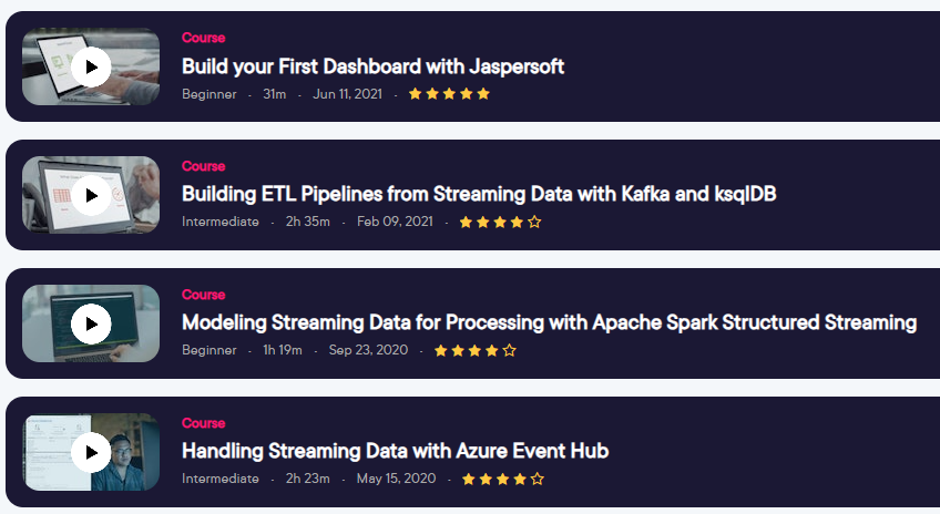
When I was doing a course on ksqlDB for Kafka, I ran into a particular problem. Because ksqlDB was a thin layer of SQL on top of a well-known Kafka infrastructure, so much of the content assumed you were experienced and entrenched in the Kafka ecosystem. It quickly covered terms and ideas that made sense in that world, but no sense if you were coming from the relational database world.

And a thing I would keep asking, to no one in particular, was “How did we end up here?”. What was the pain point that caused people to create an event stream technology and then put a SQL querying language on top instead of just using a relational database. I talk about this more on a podcast episode with the company that made ksqlDB.

Azure Synapse has a similar problem. It is an iteration on various technologies over the past decade. And it’s designed to support large datasets (multi-terabyte) and complex enterprise scenarios. And so a lot of the content out there assumes a certain level of expertise, in part because the people interested in it and the people training on it are both experts.

The challenge this presents is twofold. First, the more of an expert you are, the harder it is to empathize with a new learner. Often the best teacher is someone who learned a technology a year ago, and remembers all the stumbling blocks. This is a challenge I struggle with regularly myself.

The other issue is that the content often pre-supposes the learner knows what the foundational technologies are and why they are important. It might assume the learner Knows what delta lake is, and what parquet is, and um, why are we storing all our data in flat files to begin with???

That’s not to say that every course needs to be a 9 hour foundations course. But there are ways to briefly remind the viewer why something is important, what pain point it solves, and why they should care. And if they are totally new, this helps orient them quickly.

For example, a course could say “Here we are using the delta lake approach. This allows us to enhance the efficient column storage of parquet files with ACID compliance that we usually lose out on when using a data lake.” This explains to new learners why we are here and reminds seasoned learners why they should care. This can be done quickly and deftly, without feeling like you are talking down to experienced learners.

So now what?

I’m hoping this will help folks who make content in this area. If nothing else, I hope it will be a reminder to me a year from now, when I’ve forgotten what a pain this was. In the next blog post, I’ll write about the instructional design techniques people can use to get around these issues.

Lessons learned from being self-employed: 4 years in

2022 was my best year financially and probably my worst year personally. This was the year that we achieved financial independence. We had 6-12 months of expenses in the bank and the royalties were covering our living expenses. It was also the year that I found that a relaxing weekend off wasn’t enough any more, that bouncing back wasn’t working anymore.

Too much, all at once

2021 was very quiet year as far as my consulting was concerned, about 10% of my revenue was consulting and the other 90% was royalties and completion payments. In 2022 that changed, however.

There was about 3 months where I was billing 20-30 hours per week on top of signing up for a new course near the end of it. Because the royalties were covering my expenses, this all went right into savings and we ended up with 6-12 months of savings. This is a consultant’s dream.

Unfortunately, life was occurring at the same time.

My husband had an elective surgery that we were planning for months. It went great and he’s completely recovered. What this meant, though, is that I was tasked as nurse for 2 weeks and janitor for 3 months. I was suddenly doing all the chores that I had taken for granted, while also working 40-50 hours per week.

Near the end of this my mom started having issues as well. The isolation of Covid was finally taking it’s toll and she was having more issues. She was clearly lonely and bored and only really got out of her apartment every other week.

This also has been largely resolved, but for a while I was bribing myself with Magic the Gathering boosters to call her every day and check up on her. We’ve increased the services that she’s receiving, and she gets out twice a week now, but during the summer it was a really challenging time.

When your body stops working

I think many would describe what I went through as burnout. I’m not sure of the right term, but stuff just stopped working. More coffee didn’t help. I would schedule a weekend to catch up on a course and get nothing done. I would take a few extra days off, to no lasting effect.

Something broke.

Realizing I needed something more, I schedule 2 weeks off at the end of the year. As a consultant it’s difficult to take time off unless you plan it far in advance. It’s even more difficult if you feel like you are always behind on projects. I only made 2 courses this year and the second one was 3 months late, horrifically overdue.

I’m one week in and I think this was 100% the right choice, I needed a deeper rest to catch up from the last 3 years.

A gut punch from Pluralsight

A couple of years ago, Pluralsight was purchased by private equity. I was cautiously optimistic at the time that this might enable them to get away from the quarterly cycle of the stock market. The results were mixed, with them making a very large acquisition of A Cloud Guru, which is still resolving.

But in December this year, the company had 20% layoffs essentially firing 400 employees. There were also changes for authors, and while I can’t get into the details, I’m expecting my royalties to go down 25%. This will put me below sustainability, with royalties no longer covering 100% of my living expenses.

So now what

For now I’ve been focusing on enjoying my vacation, recovering from 2022, and not worrying about the short term. I’ve also been reaching out to colleagues and peers, asking for advice.

I no longer see PS as a sustainable career, which means looking into doing more consulting or selling my content elsewhere. I could also get a regular W-2 job, but I would lose much of the flexibility that helps me take care of my mom.

In the end, I think I’ll be fine. But I have no idea what I’ll be doing for a living by the end of 2023.

Getting over yourself: 5 reasons why you should present

If I would write a book on becoming a technical presenter, chapter 0 would be on deciding to actually do it. This is the biggest hurdle for folks, they seem to always come up with reasons why they shouldn’t. This is totally understandable! I was practically shaking when I gave my first presentation, but if I had never taken that first step, I would never be able to making training content for a living.

So in this blog post, I’m going to try to help people get past step 0. Some of the reasons are altruistic and some of them are more selfish, but I think there are plenty of reasons why you should do it.

1. Learners have a unique perspective

I think the biggest issue is folks feeling like they have to be experts, like they have to be perfect. That simply isn’t true. I do think it’s important to preface the beginning of a talk with your experience level, to set expectations. But beyond that, you are golden. Often times in my line of work, I have to learn a new piece of technology in two months and then make a course on it.

To emphasize the previous point a bit more, people who are just learning a technology or are new in a field have a unique perspective that is difficult to find. Good teaching involves an aggressive sense of empathy for your audience, for the learner. And the longer you have been working with a technology, the harder that becomes. Very quickly you forget how hard it is to get a development environment up and running. Very quickly you forget how unintuitive some of the technical terms are.

Learners are going to have a greater sense of empathy with their audience and can warn people about the roadblocks with getting started. This is a rare resource.

2. The community needs new speakers and fresh faces

I know when I was helping run the local Power BI user group, it was a challenge to find speakers. I gave probably a third of our presentations the first year we got started, jsut to try to fill the slots. I think the biggest challenge of running a user group is finding speakers, and user group leaders are always grateful when someone volunteers to speak, regardless of their skill level.

But beyond local groups, the broader community needs new and different speakers. Because of the amount of effort and resources speaking requires, and because of the bias towards “expertise”, you tend to have the same handful of speakers talking about a given subject.

These folks can often be opinionated or set in their ways. It can be value to have other folks who have a fresh perspective, who can help identify different ways of doing things. This is especially true in areas like business intelligence, where it is less about best practices and more about the context of the business you are working in.

3. Sharing content is the best way to learn

Ultimately, to learn well we need something that challenges our assumptions and identifies gaps in what we know. Reading blogs or watching videos usually doesn’t do this because there are two layers of bias going on.

First, it only includes what the author thought was important to include. This often doesn’t include gotchas, edge cases, or things the author assumes everyone knows already. Second, there’s your own bias. When we are doing just-in-time learning, we are often focused on solving a specific problem and will learn just enough to feel comfortable solving that problem. Rarely do we ask “Okay, what am I missing? What could go wrong?”.

But when you try to do something in your homelab, you often find all the setup tasks that weren’t mentioned in the tutorial. You find the things that could (and do) go wrong. When you give a presentation, you think through all the questions someone might ask and so you are forced to learn a subject more deeply.

And as you present multiple times, you run into different questions and develop and intuition for the kinds of things someone might ask you. Giving a presentation with demos is often the best of both worlds, because you have to test it and anticipate whatever questions people might have.

4. Becoming a good speaker takes time and practice

Becoming a good presenter takes time, there’s just no way around it. Even if you are naturally good speaker, there are a set of skills you can only get from practice. One of the biggest one is pacing. When I started speaking, I would either get nervous and speed through my content, or I would get too excited and go over on time.

Being able to stay focused, manage your time, and handle questions or interruptions are all things you have to learn through practice. If you wait until you are an expert speaker to start speaking, this will never happen. Depending on your experience, you might have to present a dozen times to really find your voice and pace.

5. Speaking is good for your career

Presenting is, in my opinion, great for your career. No one should feel obligated to speak as part of their career growth, but it provides a chance to practice a bunch of skills that may not come up normally in your day to day work. In my experience, if you can get comfortable speaking to 70 strangers, it become much easier to talk with 2 of your coworkers. By practicing refining your content, your communication in general become more clear and crisp. But anticipating questions in your presentations, you anticipate things that could go wrong in a project.

It’s also a chance to develop peer relationships that will help you throughout your career. When I go to events these days, the thing I cherish the most is sitting in the speaker’s room and just hearing people chat. I’ve been able to build connections and get my name out there, which has been tremendously helpful for my career. And as a result, when I need help with something, I’ve been able to reach out to those speakers for help and vice versa.

Summary

In summary, speaking can both provide a unique perspective for your audience, and help you grow both as a presenter and as a technical expert. Local user groups and virtual groups are often grateful to have new speakers and can provide a low-risk environment to work on your skills and grow. As time goes on, it can open up opportunities such as consulting that depend on having those communication skills.