Last week I struggled to load and process the data. I was frustrated and a good bit disoriented. This week has been mostly backing up (again) and getting a better idea of what’s going on.
Understanding Databricks is core to understanding Fabric
One of the things that helps to understand Fabric is that it’s heavily influenced by Databricks. It’s built on delta lake, which is created and open sourced by Databricks 2019. You are encouraged to use a medallion architecture, which as far as I can tell, comes from Databricks.
You will be a lot less frustrated if you realize that much of what’s going on with Fabric is a blend of open source formats and protocols, but also is a combination of the idiosyncrasies of Databricks and then those of Microsoft. David Gomes has good post about data lake file formats, and it’s interesting to imagine the parallel universe where Fabric is built on Iceberg (which is also based on Parquet files) instead of delta lake. (Note, I found this post from this week’s issue of Brent Ozar’s Newsletter)
It was honestly a bit refreshing to see Marco Russo, DAX expert, a bit befuddled on Twitter and LinkedIn about how wishy-washy medallion architecture is. This was reaffirmed by Simon Whitely’s recent video.
This also means that the best place to learn about these is Databricks itself. I’ve been skimming through Delta Lake: Up & Running and finding it helpful. It looks like you can also download it for free if you don’t mind a sales call.
What should I use for ETL?
After playing around some more, I think the best approach right now is to work with notebooks for all of my data transformation. So far I see a couple of benefits. First, it’s easier to put the code into source control, at least in theory. In practice, a notebook files is actually a big ol’ JSON file, so the commits may look a bit ugly.
Second, it’s easier from a from a “I’m completely lost” perspective, because it’s easier to step through individual steps, see the results, etc. This is especially true when Delta Lake: Up & Running has exercises in PySpark. I’d prefer to work with dataflows because that’s what I’m comfortable with, but clearly that hasn’t worked for me so far.
Clip from the book
Tomaž Kaštrun has a blog series on getting into fabric which shows how easy it is to create a PySpark notebook. I am a bit frustrated that I didn’t realize notebooks were a valid ETL tool, I always thought of them being for data science experiments. Microsoft has some terse documentation that covers some of the options for getting data into your Lakehouse. I hope they continue to expand it like they have done with the Power BI guidance.
Last week, I struggled to load the data into Fabric, but finally got it into a Lakehouse. I was starting to run into a lot of frustration, and so it seemed like a good time to back up and get more oriented about the different pieces of Fabric and how they fit together. In my experience, it’s often most effective to try to do something, review some learning, and alternate. Without a particular pain point, it’s hard for the information to stick.
As an aside, I wish there was more training content that focused on orienting learners. In her book, Design for How People Learn, Julie Dirksen uses the closet analogy for memory and learning. Imagine someone asks you to put away a winter hat. Does that go with the other hats? Does it go with the other winter clothes? An instructor’s job is to provide boxes and labels for where knowledge should go.
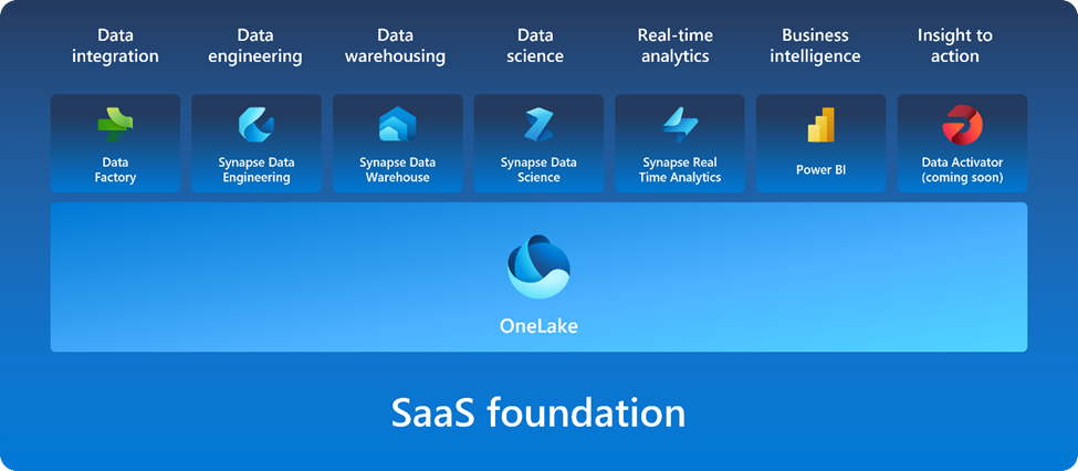
Orienting training content says “Here are the boxes, here are the labels”. So if I learn Fabric supports Spark, should I put that in the big data box, the compute engine box, the delta lake box, or something else entirely? If you are posting the Microsoft graphic below without additional context, you are doing folks a disservice, because it would be like laying out your whole wardrobe on the floor and then asking someone to put it away.
Getting oriented
So, to get oriented, first I watched Learning Microsoft Fabric: A Data Analytics and Engineering Preview by Helen Wall and Gini von Courter on LinkedIn Learning. It was slightly more introductory than I would have liked, but did a good job of explaining how many of the pieces fit together.
Next, I starting going through the Microsoft learning path and cloud skills challenge. Some of the initial content was more marketing and fluffy than I would have preferred. For example, explanations of the tools used words from the tool name and then fluff like “industry-leading”. This wouldn’t have helped me at all with my previous issue last week of understanding what data warehousing means in this context.
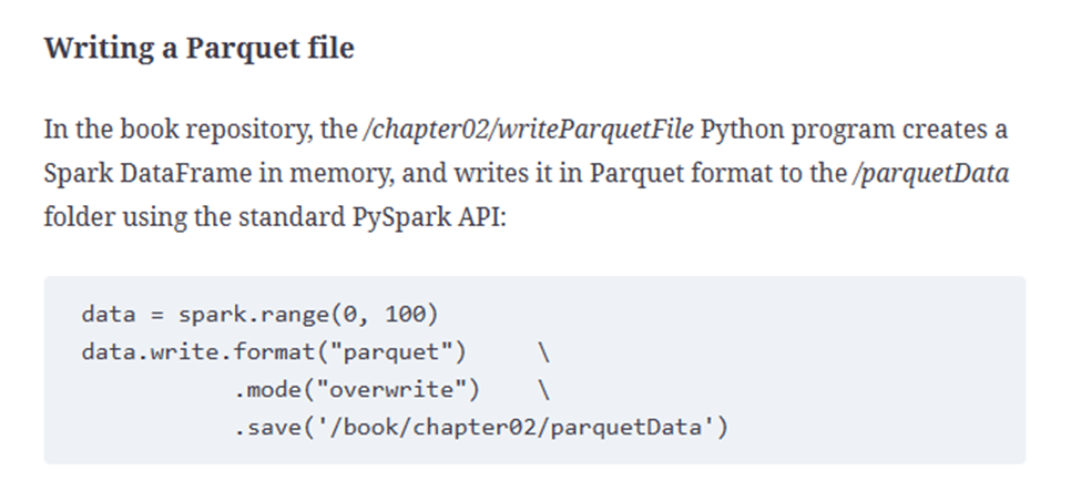
After some of the fluff, however, Microsoft has very well written exercises. They are detailed, easy to follow, and include technical tidbits along the way. I think the biggest possible improvement would be to have links to more in-depth information and guidance. For example, when the Lakehouse lab mentions the Parquet file format, I’d love for that to have a link explaining Parquet, or at least how it fits into the Microsoft ecosystem.
Trying it with the MTG data
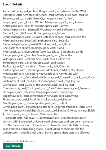
Feeling more comfortable with how Lakehouse works, I try to load the CSV to a lakehouse table and I immediately run into an error.
It turns out that it doesn’t allow for spaces in column names. It would be nice if it provided me with an option to automatically rename the columns, but alas. So next I try to use a dataflow to transform the CSV into a suitable shape. I try loading files from OneLake data hub, and at first I assume I’m out of luck, because I don’t see my file. I assume this only shows processed parquet files, because I can see the sales table I made in the MS Learn lab.
It takes a few tries and some digging to notice the little arrow by the files and realize it’s a subfolder and not the name of the folder I’m in. This hybrid files and tables and SQL Endpoints thing is going to take some getting used to.
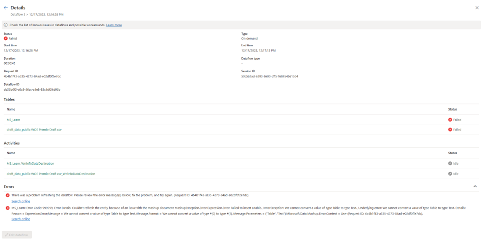
I create a dataflow based on the file, remove all but the first few columns and select publish. It seems to work for a while, and then I get an error:
MashupException.Error: Expression.Error: Failed to insert a table., InnerException: We cannot convert a value of type Table to type Text.
This seems…bizarre. I got back and check my data and it looks like plain CSV file, no nested data types or anything weird. Now I do see table data types as part of the navigation steps, but none of the previews for any of the steps show any errors. I hit publish again, and it spins for a long time. I assume this means it’s refreshing, but I honestly can’t tell. I go to the workspace list and manually click refresh.
I get the same error as before, and I’m not entirely sure how to solve it. In Power BI Desktop, I’m used to being taken to what line is producing the error.
It turns out that I also had a failed SQL connection from a different workspace in the same dataflow. How I caused that or created it, I have no idea. The original error message did include the name of the query, but because I had called it MS_learn, I thought the error was pointing me to a specific article.
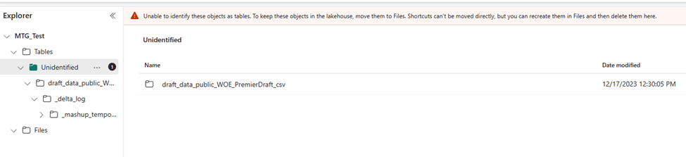
It takes about 15 minutes to run, then the new file shows up under…tables in a subfolder called unidentified. I get a warning that I should move these over to files. It’s at this point I’m very confused about what is happening and what I am doing.
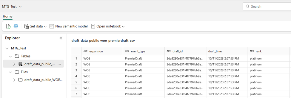
So, I move it to files, and then select load to tables. Do that seems to work, although I’m mildly concerned that I might have deleted the original CSV file with my dataflow because I don’t see it anymore.
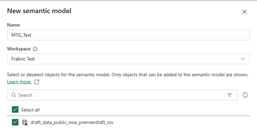
Additionally, I notice that I have been doing this all in My Workspace, which isn’t ideal, but that when I create a semantic model, it doesn’t let me create it there. So I have to create it in my Fabric Test workspace instead.
Regardless, I’m able to create a semantic model and start creating a report. Overall, this is promising.
Summary
So far, it feels a lot like there is a lot of potential with Fabric, but if you fall off the ideal path, it can be challenging to get back onto it. I’m impressed with the amount of visual tools available, this seems to be underappreciated when people talk about Fabric. It’s clearly designed to put Power BI users at ease and make the learning experience better.
I’m still unclear when I’m supposed to put the data into a warehouse instead of this current workflow, and I’m still unclear what the proper way is to clean up my data or deal with issues like this.
I want to preface that a lot of the issues I run into below are because of my own ignorance around the tooling, and a lot of the detail I include is to show what that ignorance looks like, since many people reading this might be used to Fabric or at least data engineering.
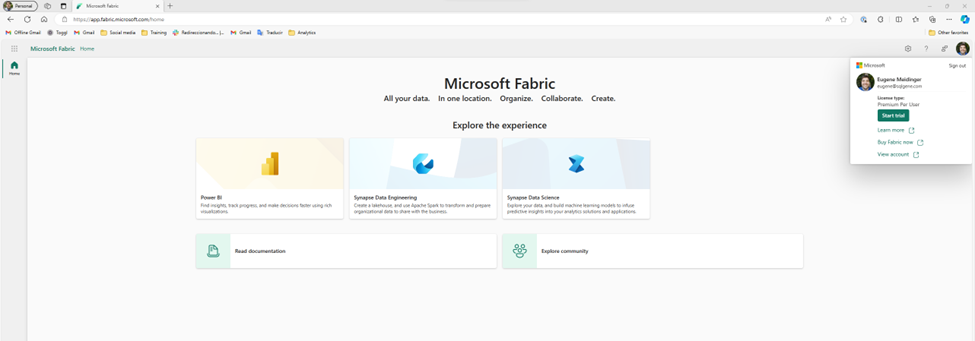
So, last week we took a look at the data and saw that it was suitable for learning fabric. The next step is to upload it. Before we do anything else, we need to start a Fabric Trial. The process is very easy, although part of me would have expected it to show up on the main page and not just in the account menu. That said, I think the process is identical for Power BI.
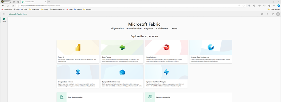
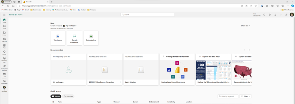
Once I start the trial, more options show up on the main page. Fabric is really a collection of tools. I like that there are clear links at the bottom for the documentation and the community.
I think something that could be clearer is that the documentation includes tutorials and learning paths. While I understand that the docs.microsoft.com subdomain has been merged into the learn.microsoft.com subdomain, when I see “Read documentation” I assume that means stuffy reference material as opposed to anything hands on. This is an opportunity to take a lesson from Power BI Desktop by maybe having an introduction video, or at least having a “If you don’t know where to start, start here” link.
Ignoring all of that, the first I’m tempted to do is select one of these personas and see if I can upload my data. So, I take a guess and try Data Warehouse. Unfortunately, it turns out that this is more a targeted subset of the functionality. Essentially, as far as I would be aware, I’m still in Power BI. This risks a little bit of confusion, because the first 3 personas (Power BI, Data Factory, and Data Activator) are product names, so I’m likely to assume that the rest of them are also separate products. In part, because that’s how it historically has felt to me in Azure, as I’ve talked about when first learning Synapse.
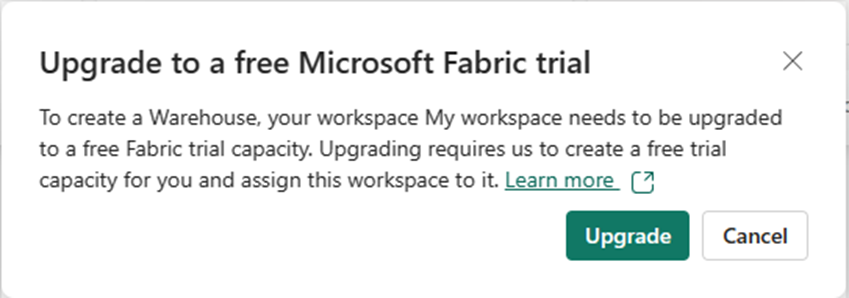
Now thankfully, I’m aware that the goal of Fabric is to have more of a Power BI style experience, so I’m able to quickly orient myself and realize it is showing me a subset of functionality instead of a singular tool. I also see “?experience=data-warehouse” in the URL which is also a hint. So, I go ahead and click on the warehouse button, hoping this is what I need to upload my data. Unfortunately, I get a warning.
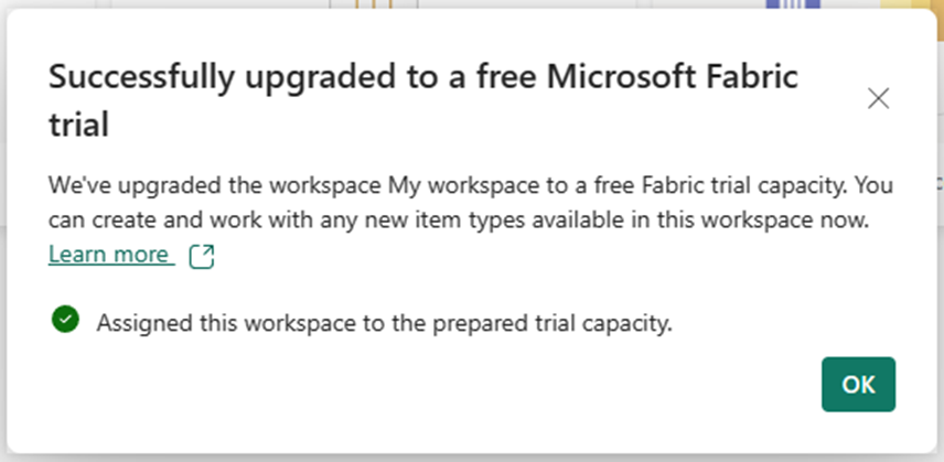
The warning says I need to upgrade to a free trial. But I just signed up for the free trial! Reading the description, I realize that I need to assign my personal workspace to the premium capacity provided by the free trial. This is a little confusing, and at first I had assumed I ran into a bug. I click upgrade and it works.
Finding where to put the data
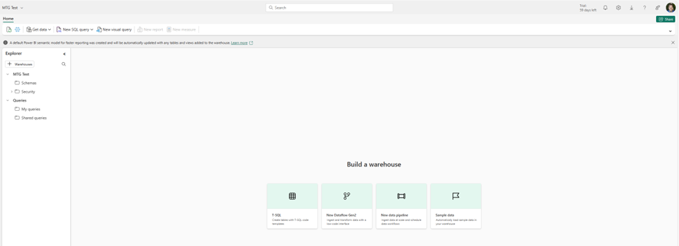
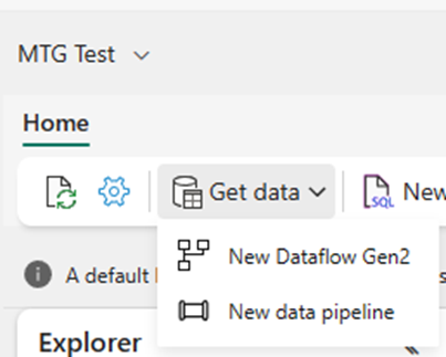
Next it asks me for the name of my warehouse. I choose “MTG Test” and cross my fingers. Overall it seems to work. Again, I’m presented with some default buttons in the middle. I see options for dataflows and pipelines, and I assume those are intended for pulling data from an existing source, not uploading data. I also see an option for sample data, which I really appreciate for ease of learning.
I see Get Data in the top left, which I find comforting because it looks a lot like Get Data for Power BI, so let’s take a look. Unfortunately, it’s the same 2 buttons. So, we are at a bit of an impasse.
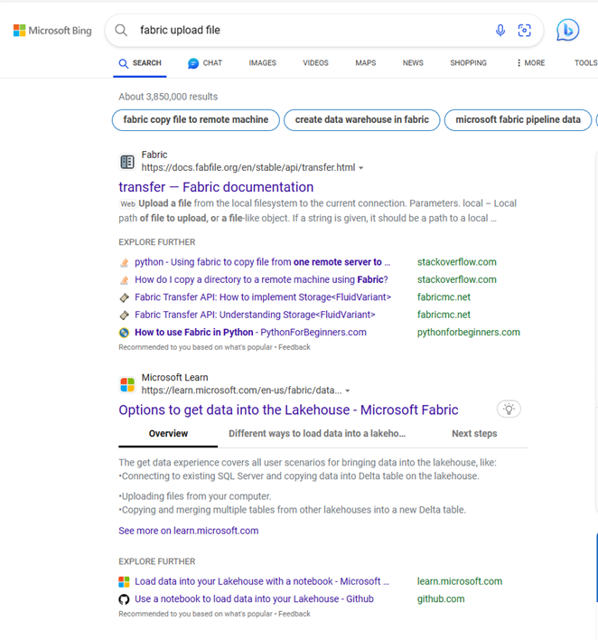
I click on the dataflow piece, but I’m starting to feel out of my depth. If my data already existed somewhere, I’d be fine, but it doesn’t. I have to figure out how to get the data into the data lake. So I back up a bit and then Bing “Fabric file upload”. The second option is documentation on “Options to get data into the Fabric Lakehouse”.
The first option shows how to do it in the lakehouse explorer. I go back to my warehouse explorer, looking for the tables folder, but it’s not there. I see a schemas folder, which I assume is maybe a rename like how they recently renamed datasets to semantic models. I assume that maybe schemas are different than tables and that I need to find a more detailed article on Lakehouse Explorer. It probably takes me a full minute to realize that a warehouse and a lakehouse are not the same thing, and that I’m probably in a different tool.
So, I backup again and search for the more specific query “fabric warehouse upload”. I see an article called “Tutorial: Ingest data into a Warehouse in Microsoft Fabric”. I quickly scan the article and see it suggesting using a pipeline to pull in data from blob storage. So I know that’s an option, but I’m under the vague impression that there should be a way to upload the data directly in the explorer.
Giving up and trying again
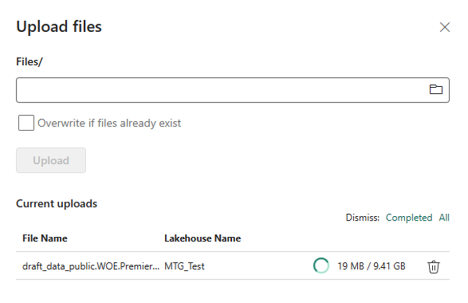
I dig around in Bing some more and I find another article called “Bring your data to OneLake with Lakehouse”. From demos I’ve seen of OneLake, it’s supposed to work kinda like One Drive. At this point I know I’m misunderstanding something about the distinction between a warehouse and a lakehouse, but I decide to just give up and try to upload data to a lakehouse. The naming requirements are more strict so I make MTG_Test.
I got to get data, I see the option to upload files. I upload a 10 gigabyte file and it works! Next week I’ll figure out how to do something with it.
Summary
Setting up the fabric trial was extremely easy and well documented. As far as I can tell, there’s a lot of getting started documentation for Fabric, but I wish it was surfaced or advertised a bit better. I run into a lot of frustration trying to just upload a file, in part because I don’t have a good understanding of the architecture and because my use case is a bit odd.
Overall, I’m feeling a bit disheartened, but I have to remind myself that I ran into a lot of the same frustrations learning Power BI. Some of that was the newness, some of that is learning anything, and some of that I expect the product team will smooth out over time.
I also acknowledge that I’d probably have an easier time if I just sat down and went through the learning paths and the tutorials. In practice though, a lot of times when I’m learning a new technology I like to see how quickly I can get my hands dirty, and then back up as necessary.
This is week 1 where I try to take Magic the Gathering draft data to learn Microsoft Fabric. Check out week 0 for some reasoning why.
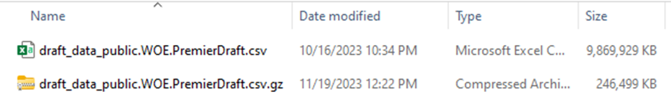
So, before I do anything else, I want to get a sense of the data I’m looking at to see if it’s suitable for this project. I download the data, and because it’s gzipped, I use 7-zip to open it up on windows 10, or Windows explorer on Windows 11. In either case, the first thing I notice is the huge size disparity. When compressed, it is a quarter of a gigabyte. Uncompressed, it’s about 10 GB. This tells us something.
The longer you work in business intelligence, and especially in consulting, the more you start picking up clues and making inferences. You do this because scope creep is extremely prevalent in BI, and if you are a consultant you might be the one paying for it. So, what does 40x compression difference tell us about the data?
40x is abnormal. In my experience with the Vertipaq engine in Power BI, on a good day you are looking at 5-10x compression compared to a SQL backend. So, we know that there is a lot of repeated data. Because this is the only file for this data, we can infer that we will have to do quite a bit of normalization. CSV is a flat format, so the source data is likely heavily denormalized in this case. I would be shocked if there was any nested or hierarchical data like you might expect with JSON.
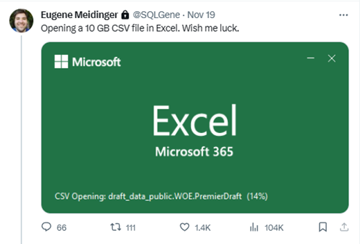
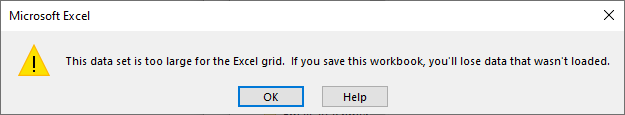
The next step is to take a peek at the data. There might be documentation somewhere, but for whatever reason I prefer to just take a look and get a feel for it. So how do we do that? Well, someone experienced would probably use a dedicated tool for large files. But I’m not experienced, so I confirm that I have 32 gigs of RAM, double click on the file and cross my fingers. In doing so, I create the most viral tweet of my career.
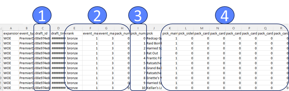
Excel complains that there are too many rows, but eventually shows me the first million of them. I take a quick glance to get oriented. The very first thing I’m scanning for is anything with the word “id” in it (1). The next thing I’m scanning for are repeated values (2), these are likely to go with the id as a header table or dimension table. Then I see pick number incrementing (3), so it’s likely functioning as a line number. Then I see a bunch of ones and zeros (4) to the right, and I don’t like that.
Issues with the data
I don’t like that because it’s data I don’t know how to deal with. My first guess is it’s data for data science that’s been turned into features. Columns like this are great for running experiments, but awful for traditional analytical reporting. I’ll likely have to reshape the data into something more dimensional, but I’ll have to learn how best to store this information. Doing a pivot is simple enough, but I have a nagging feeling I’m missing something.
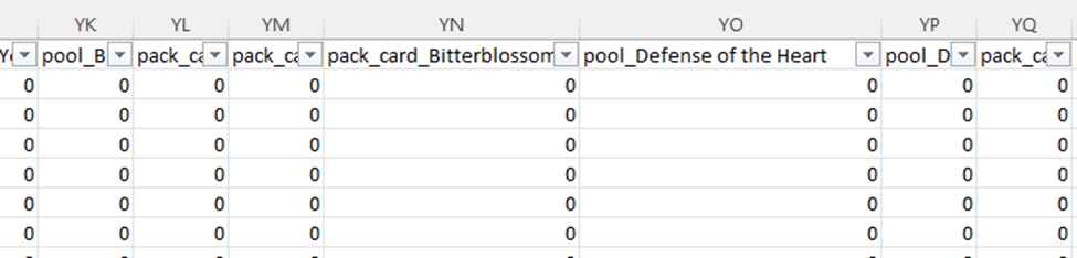
So, the next question, is just how many columns do we have and what do they look like? I scroll over all the way to the right, and I see the letters YS. I don’t know how many that is, but I know it’s bad. Typically, in my work it never gets past A and another letter. I check and there are 672 columns!!!
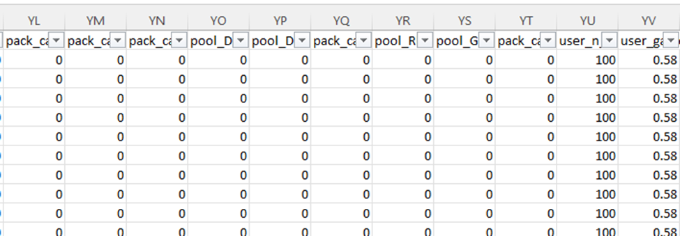
Why so many columns? This data is around drafting Magic the Gathering cards. So, for each card in the specific magic set (a quarterly release of cards), we have a column if it was possibly in that card pack (the cards the player can choose from), as well as in the player’s already selected pool (the cards they’ve drafted). Essentially, for every card they could possibly see in a draft we are tracking what they have seen as well as what they have picked.
Accordingly, we have a very sparse dataset. Based on how the math works out, these columns will have 0 the vast majority of the time. I know that having lots and lots of columns interferes with run-length encoding, so leaving the dataset as is not ideal from a compression and performance standpoint. This does explain why the data compresses so well though, since most of it is long chunks of 0s and commas. The gzip algorithm is able to see that and substitute it.
There’s another issue with this shape. We have columns with specific names of the cards. The cards available each set are completely different, with only a handful of repeats. This means if we just merged in the schema each new set, we would have thousands of columns. This simply isn’t feasible; we have to reshape the data. We are going to need to learn how to dynamically unpivot the data, probably in Azure Data Factory, which I have no experience in.
Coincidentally, Javier Villegas was giving a presentation on data ingestion in the Data Toboggan conference. I think an important part of learning technologies is giving yourself the chance for “serendipity” or “luck”. If you are regularly bumping into content, you can find content that is relevant to the problems you have. As I mentioned in week 0, if you don’t have active problems or active tasks you sometimes have to make your own.
Summary
We can tell the data is abnormally compressible and we need to figure out why. It turns out it is a sparse data set. The first thing I do is rapidly scan for id fields, numerically incrementing fields, and repeated values to get a sense of how I might normalize the data. Based on the current shape of the data, I know I’m going to have to pivot it. I’ll probably have to learn Azure Data Factory for that, but we’ll see. I know vaguely that Fabric has support for PowerQuery.
I’ve written before about struggling to learn Azure Synapse, and I’ve struggled as well with getting excited about Microsoft Fabric. I think the pitch and the potential of Microsoft Fabric is real. The issue is that it solves problems I don’t have. In my work, I don’t deal with data so big that Power BI can’t handle it. I don’t deal with data so unstructured that Power Query can’t handle it.
But I know I need to learn Fabric. Power BI is a part of Fabric, the integrations are only going to continue to improve. If nothing else, I need to be able to tell customers if they should look into using Fabric or not. So what do you do when there is a technology you aren’t excited about, but have to learn?
One solution is to get certified. In the past, I’ve written about how I find certs to be useful learning paths and something concrete to focus on. Last week they announced the DP-600 certification which looks promising for that. Another option is to take on a work project that is a bit of a stretch and then learn on the job. As a consultant, that’s always a bit of a catch-22 because you are selling yourself based on expertise you theoretically already have. The last option is to create a homelab and a side project.
The challenge, though, is what do you put up there for a homelab? A lot of publicly available data is boring, purely descriptive, and/or already cleaned. For simple descriptive reporting, that’s perfectly fine. But for Fabric you want big data, ugly data, changing data. In comes the Magic the Gathering card game and a little data tracking project called 17lands.
Magic the Gathering and its big data revolution
Magic the Gathering, if you don’t know, is a competitive trading card game. With the rise of its online client, MTG Arena, it’s been going through a similar revolution like baseball and Sabermetrics (or so I assume, I’m not a sports guy). Now, instead of speculating which cards from a new set are the best, it’s possible to track in that in real-time thanks to a project called 17lands which collects data from players who opt in.
This has allowed for fascinating analysis. Even if you don’t play, I recommend checking out this video below. It’s fascinating to see how the “metagame” of a format evolves over time as people realize which cards are good and which cards are bad. It also allows for a lot of amateur analysis, for good and for bad. Then every 4 months it happens all over again with a new release.
This data seems ideal for a few reasons, first the raw data is big but manageable. A single “season” is 10 GB uncompressed, and 0.25 GB compressed. I did learn that Excel will try its best to open 10GB file, yell at you about too many rows, and then show you’re the first million. The 40x compression also suggests that the data is very denormalized and would benefit from some normalization.
It did end up showing me the first million rows
The second reason is that the schema is a mess. The data has over 600 columns, many of which are numerical flags for each individual possible card, which changes from season to season. Trying to manage this in Power Query is theoretically doable but likely very frustrating.
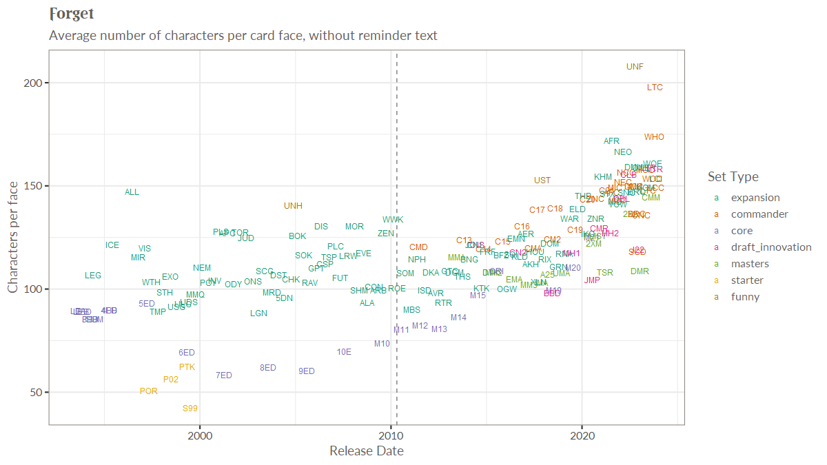
Finally, it’s something I’m interested in. MTG_ds on Twitter is constantly posting graphics like this (increasing wordiness of cards each release), with insights hiding behind the high level numbers.
A chart showing increasing wordiness of cards over time
There are actually questions that people are interested in, that aren’t easy to answer. I like to make replayable subsets of cards called “cubes“, so being able to do things like mathematically optimizing based on cost and fun are interesting to me.
Calling my shot
I think with this sort of thing, it’s important to document your expectation and pain points, because you only get to be a newbie once. I’ll try to write down my expectations ahead of time so we can see where I’m wrong.
From what I’ve seen so far, I expect the learning path at learn.microsoft.com to be very helpful in getting oriented. I expect a lot of content online to be frustrating, because so much of it assumes you have a data lake and know what you are doing.
Speaking of which, my background is as a former DBA and now Power BI consultant. I’ve never touched ADF, data lakes, or ML in and professional capacity. As the title says, I’m going to be winging it. What I do have, however, is experience having to learn a new technology in 2-3 months (see the course below) and experience breaking down big BI projects into smaller chunks.
The one year I needed to pay the bills and made courses on technology I had never seen before.
I hope you enjoy watching the ride and let me know if there’s anything specific you’d like me to include.
Tonight I got to present remotely to the Wisconsin SQL Server User Group on Execution plans. While it was definitely an honor, it was a challenge trudging through with a sore throat and cough. Below are the slides and code: Execution Plan Essentials 2017-12-12
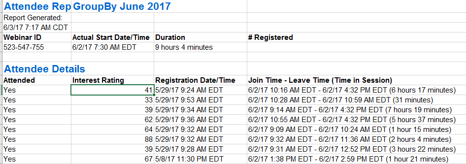
Normally this would be a giant pain to work with. When it comes to data quality, this is quite the
Excel is going to make some assumptions about what is part of the table. This is convenient for our needs, but we’ll have to find a work around when we want to scale to multiple excel files.
We can’t tell it we have headers, because it’s going to think that first row is a header. We’ll deal with that later. Once we click OK, we are taken to the Power Query / Power Pivot window.
I made a mistake
Hmm, so it looks like I made a mistake. I hope my honesty won’t lose me any
Trying again
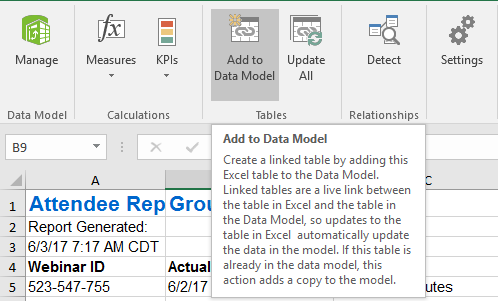
Let’s take a different approach. I’m going to open a blank excel workbook and pull the data into there. Okay, so let’s go to manage under the Power Pivot tab.
Next, we are going to click “Get External Data From Other Sources”
Then I’m going to scroll to the bottom and select Excel File.
Once selected, I only have the whole first sheet as an option. If I had table objects or named ranges, that would be different.
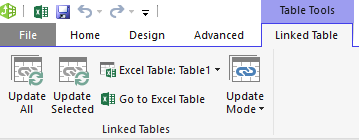
Hmmm, I still can’t find a way to edit the Power Query. Fiddlesticks!
Normally, in Power BI it would be right here:
Trying to do this in Excel is quite the
Okay, let’s try opening that Excel file. Ah, much better. Now I want to click Edit at the bottom right.
Cleaning the Data
So, First thing we need to do is get rid of all of the non-header rows at the top.
To do that, I just select Remove Rows –> Remove Top Rows.
Then I specify I want to get rid of the top 7 rows.
Next, I want to turn the actual header row into a header.
Okay, so now it looks like a real table.
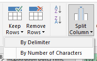
Comma Delimited BS
Okay, so now we need to parse out the times someone was watching. The problem is that some people were in and out. Their entries are comma delimited. Ugh.
Okay, let’s split them up. I’m going to select Split Column –> By Delimiter
Unfortunately, splitting by column a) splits into more columns and b) you have to specify how many.
Thankfully, we can select those new columns and unpivot them.
Perfect. Now we have a row for every time a person as watching.
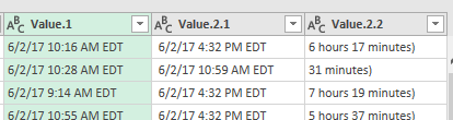
String parsing
Okay, so now we just need to parse out the dates. First, we are going to split on the dash, and then the parenthesis.
This is starting to look good.
Now we just need to get rid of the timezone and convert it to a datetime. First we need to select Replace Values.
Lastly, we select the data type we want.
What’s next?
Now that are data is cleaned up, we’ll join to sessions table and do some simple data modeling. But that’s for the next blog post.